We all need symbols to navigate the world.
Some of them are very clear, like a stop sign or a green light.
Some are not quite as apparent — like these hilariously confusing toilet signs.
And people who work in specialized fields also benefit when there are efficient icons that tell them what's going on.
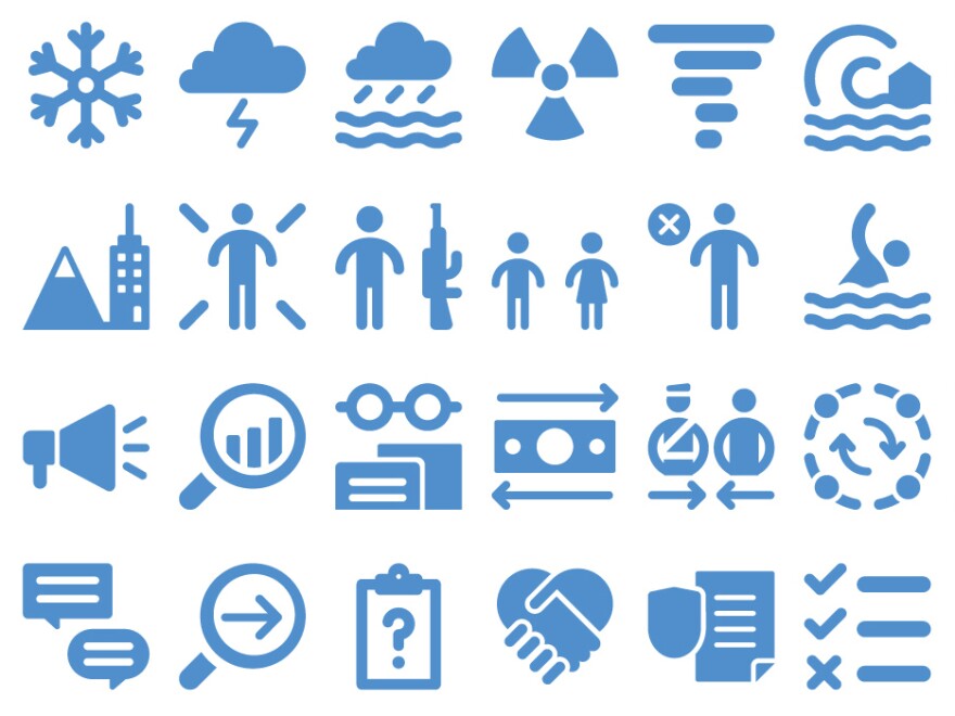
Back in 2012, UNOCHA, the U.N.'s humanitarian agency, created 250 specialized icons to use on maps, infographics and other materials. The pictographs represent all types of topics, including disasters, food aid, transportation and damage to infrastructure.
They are available for the public to download for free on the websites like ReliefWeb and nounproject.
"They were created to make crisis-related information easier to understand," says Russell Geekie, Jr., a spokesperson for UNOCHA. "When an emergency unfolds, it is important that humanitarians are able to gather and share data on the location and needs of affected people so that we can better coordinate our response."
The icons were a hit. They've been downloaded more than half a million times from nounproject alone since 2012. "We soon realized that there was a great demand for icons, getting requests for downloadable files all over the world," says Geekie.
In December, UNOCHA released a redesigned set of 295 icons, and added symbols that represent new innovations in aid, for example, cash transfers.
The designers also updated some of the icons, too. The 2012 iconography depicted the wrong snake in a symbol for health, for example. "We erroneously used the 'Caduceus,' a symbol of commerce, instead of the 'Rod of Asclepius,' the actual symbol of medicine," says Paolo Palmero, an information management officer at the U.N. who helped work on the project.
Geekie says he's seen the icons in documents not just at UNOCHA, but in other U.N. agencies and the International Federation of Red Cross and Red Crescent Societies.
They're also used at refugee and migrant camps. Timo Luege has used the UNOCHA pictographs in his own work as an information communications consultant for humanitarian organizations.
In 2016, Luege used some of the symbols to create signage for a refugee and migrant housing project in Greece. "Anything from 'this way to the toilet' to 'here's the WiFi point,' to 'mobile charging station,' " he says. "You want to make it easier for people to figure out where they're going."
David Gibson, author of The Wayfinding Handbook and a veteran graphic designer, says that "the idea of [the UNOCHA] symbols and universality is great, but I question whether people understand them."
Gibson gets the need for icons that depict basic needs like food or water, but he says having 295 symbols seems "overwhelming."
Geekie says that the symbols are meant to be used with a legend or a key. But they should be easy to interpret on their own. And they definitely give a sense of the range of issues faced by humanitarian aid workers.
See if you can figure out what these six icons represent. Answers below.

Answers, clockwise from left: Child soldier, abduction, avalanche, population growth, harassment, tornado.
Copyright 2021 NPR. To see more, visit https://www.npr.org.


